 Freelancer tips
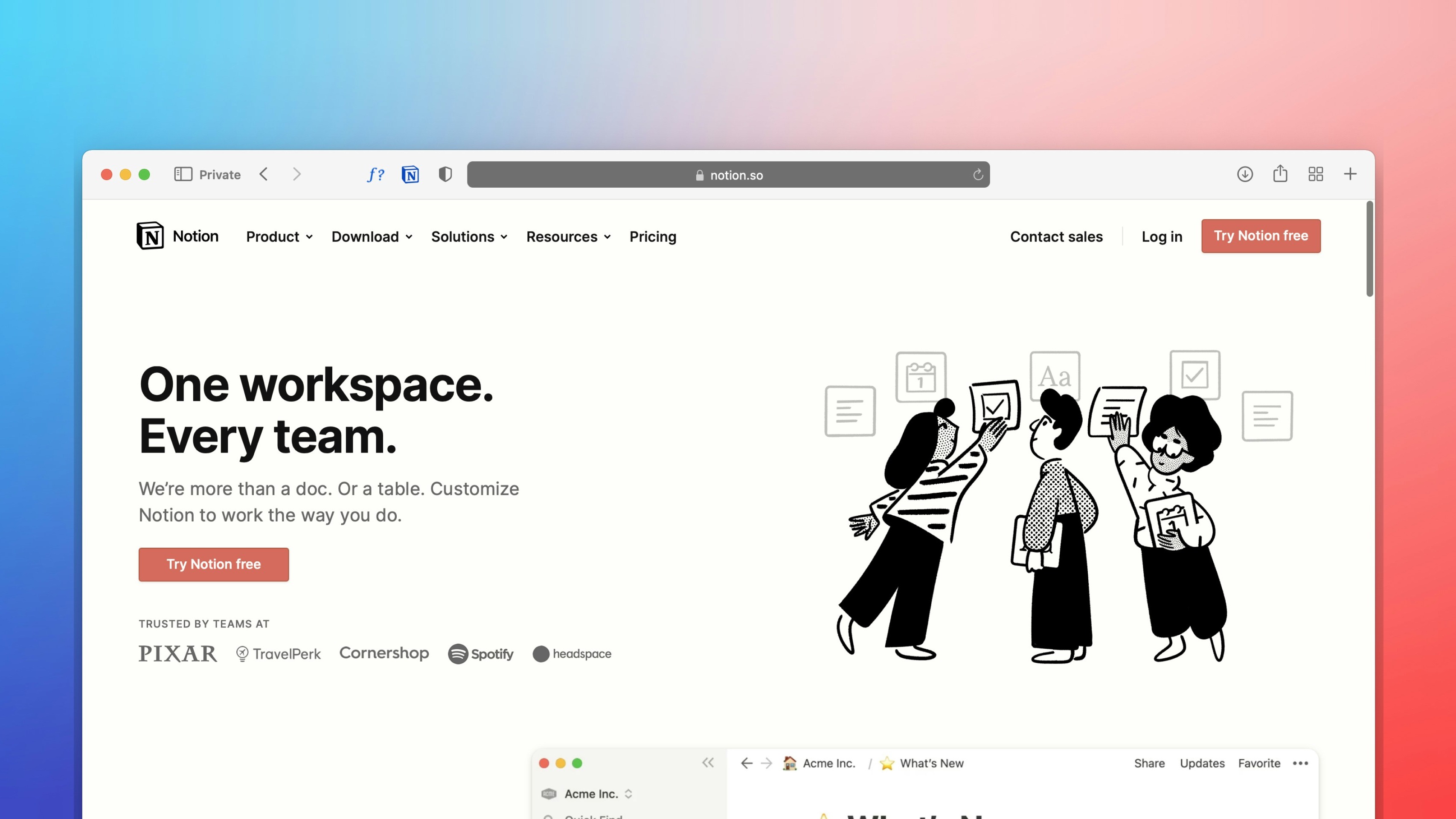
 Notion: What It Is, What It’s For, and How to Use It in Your Daily Life
Want to better organize your life and work? Notion can help boost your productivity. Click here to discover what this software is and what it’s used for.


Do you handle complex information and can't find effective ways to organize it? Try using synoptic tables, and you'll see how your workflow improves.
Synoptic tables are a type of outline used for graphic expression. However, not many freelancers even know what it is.
Are you one of them?
Then, stay and discover its definition and how you can make your own synoptic tables to unlock your potential. We offer you a guide with the necessary steps to create them and some practical examples that illustrate their application.
It is a graphical tool, also known as a synoptic map, concept chart, diagram, or key scheme. It allows organizing and presenting information in a structured and concise way, using nodes or boxes interconnected through lines. As a result, it shows the relationships and hierarchy between concepts and ideas.
Now, the synoptic table serves as a kind of visual guide, one that allows us to understand and retain complex details more clearly and orderly.
Its utility lies in its ability to simplify difficult concepts. It also lies in its power to facilitate the interpretation of the relationships between elements and assist in decision-making.
Therefore, the answer varies depending on the context. For example, it can be useful when you want to order data from a SWOT analysis of a company to obtain clearer visual results.
The synoptic table could also be useful when you want to identify focus areas in your freelance work.
Additionally, it can be useful when:
You want to visualize goals you wish to achieve.
You need to structure a plan.
You seek to highlight opportunities in your freelance business.
In other words, the tool is useful whenever you need to present a topic simply.
With technology at our disposal, it would be best to try making the synoptic table online for speed and ease. There are many websites for this, such as Miro, Canva, or Lucidchart.
Besides this, we suggest the following steps:
1. Choose a Central Theme or Concept. The first thing you need to be clear about is what the idea, theme, or general concept you want to represent in your chart is. Think carefully, as this depends on the outcome.
2. List Related Subthemes or Concepts. For the second step, brainstorming wouldn't hurt. If there are people involved, all the better, as you will need to create a list of secondary ideas related to the central theme.
3. Organize the Information Hierarchically. Organize the subthemes by hierarchy level around the main theme. Use lines to indicate the connections between the central idea and the secondary ones.
4. Use Boxes or Nodes. Place each subtheme in a box or node and around the central concept. Connect them with lines to show the links between them.
5. Include Details or Additional Information. If necessary, add details, additional information, or examples within each box or node for greater context or clarity of ideas.
These would be the essential steps. Just review and make sure the information is in order, clear, and coherent. If you see it necessary, make adjustments to improve clarity and understanding.
There isn't just one type of synoptic table; rather, there are several, each with specific characteristics and uses.
We will highlight some of the most common:
1. Key Synoptic Table. This is the most known; it is used to represent the structure of a text or document. This model summarizes the main and subordinate ideas through keys or brackets to reflect the hierarchy.
2. Diagram Synoptic Table. Characterized by presenting information in a chart, using symbols, lines, and colors to show the relationships and hierarchies between different concepts, data, or events.
3. Network Synoptic Table. This is a freer model, without any hierarchical order; ideas are represented randomly. Then, they are connected by lines to show the interdependence.
They can also be classified as:
Hierarchical.
Causal.
Comparative.
Temporal.
Conceptual.
Matrix.
There are many types to adapt to the project in question and according to its specific needs.
To give a clearer idea of their design, we bring you 10 examples of synoptic tables:
1. Synoptic Table: Psychology of Education.

2. Synoptic Table: Didactics.

3. Synoptic Table: Adjectives.

4. Synoptic Table: Disciplines of Safety and Health at Work.

5. Synoptic Table: Company Closure.

6. Synoptic Table: Systemic Anatomy.

7. Synoptic Table: Nutrients.

8. Synoptic Table: Factors of Production.

9. Synoptic Table: Social Media Strategies.

10. Synoptic Table: Solar System.

The benefits of creating synoptic tables focus on facilitating the understanding of content.
Here are the key advantages:
They are easy to make.
They allow you to better plan tasks or ideas in a visual format, simplifying time management.
They help summarize complex information to maximize communication and understanding.
Promote teamwork.
Offer a clear and orderly structure to foster clarity and keep focus on the objectives to be achieved.
Allow visualizing the relationships between different aspects within a project or between tasks.
Help you make faster and more effective decisions by providing a structured and comprehensive view of projects.
In summary, synoptic tables can become a good ally when it comes to organizing activities and effective communication.
A synoptic table is similar to a concept map in that they are visual resources. And although both can achieve great results, they have their differences in the following aspects:
The synoptic table focuses on presenting information in a linear and hierarchical way, highlighting the relationships between primary, secondary, and complementary ideas. Its main objective is to show the data in order and with logic.
On the other hand, the concept map focuses on representing connections between concepts through key ideas. Here there is no concrete order; the goal is to visualize the existing relationships between the ideas expressed.
In a synoptic table, you will see nodes or boxes that interconnect. This is done using lines that show the relationships of dependency or subordination between concepts. Its design is more formal and structured, with a clear hierarchy among the elements.
Now, the concept map uses lines and linking words to connect key ideas. It can include multiple cross-connections between different concepts, as here the order or hierarchies do not matter; its design is more flexible, branched, and non-linear.
Choosing one or the other will depend on the context and what you want to achieve. But both tools are useful for enhancing efficiency and productivity in different fields of freelance work.
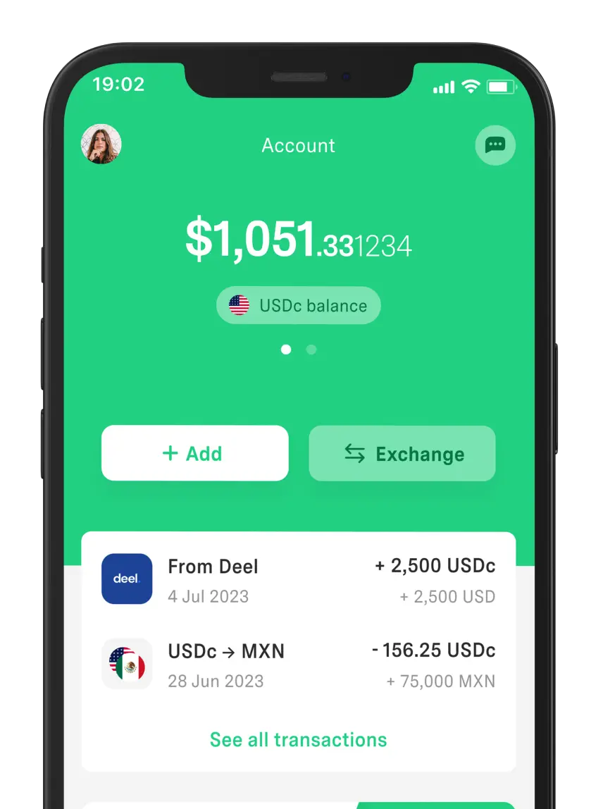
And speaking of tools, we highlight the use of DolarApp as a convenient way to save on exchange rates. The app is safe for making your online transactions, as it functions as a digital wallet that allows you to transfer and receive dollars.
Therefore, it is a reliable payment method that you can use if you have international clients to pay for your services in dollars. Great, isn't it?
The world has borders. Your finances don’t have to.
 Freelancer tips
 Want to better organize your life and work? Notion can help boost your productivity. Click here to discover what this software is and what it’s used for.

 Freelancer tips
 Project chaos? Learn how Trello can help you organize tasks and improve your productivity.

 Freelancer tips
 ClickUp can make any freelancer more productive. Discover what it is, how it works, and the advantages this tool offers you
