Your presentation starts, and within seconds, you notice distracted glances, hidden yawns, and impatience in the air. You spent hours on it, but something isn't clicking. Learning how to make creative presentations isn’t just about design—it’s about capturing attention and leaving a lasting impression.
If you want your ideas to make an impact, inspire, and convert, here you’ll discover strategies, tools, and tricks to turn any presentation into a memorable experience.
How to Make Creative Presentations? [Ideas & Tips]
What Makes a Presentation Creative? Key Characteristics
Presentations are more than just slides; they are tools to sell ideas, captivate clients, and create impact.
A boring, text-heavy presentation is like a commercial without sound—no one will remember it. But what truly makes a presentation stand out?
A clear and direct message – Too much information drives the audience away. Be concise and get straight to the point.
Engaging storytelling – People remember stories, not random facts. Use real-life examples or metaphors that connect with the audience.
Visually appealing design – Well-organized colors, typography, and graphics create harmony and professionalism.
Interactivity and dynamism – Avoid rigid formats. Include questions, subtle animations, or even live polls.
A powerful CTA – Every presentation should close with a clear action: contact, purchase, or book a meeting.
Example: If you're a web designer trying to sell your service, instead of just showing images of your projects, tell the story of how a client went from struggling sales to doubling their revenue with your design.
Where to Make Creative Presentations?
You know an attractive presentation can make all the difference, but when you open PowerPoint, it feels like all the templates look the same.
You want something more dynamic, more impactful.
So, where can you create a presentation that truly impresses?
Canva– Ideal for non-designers. Ready-to-use templates with eye-catching visual elements.
Prezi– Perfect for presentations with zoom effects and cinematic movement.
Pitch– A modern and minimalist tool focused on presenting ideas concisely and powerfully.
Google Slides– Practical and real-time collaboration, great for teams. Not much different from PowerPoint.
Genially– Specialized in interactive presentations with animated elements and hotspots.
Visme– Perfect for including interactive graphics and visual storytelling.
TIP: If you’re presenting online, use tools with live interaction features like Mentimeter or Loom to add dynamism.
Guide to Making a Creative Presentation
Step 1: Define Your Objective
Before designing, ask yourself: What do I want to achieve with this presentation? (Sell, inform, train).
Step 2: Build a Storytelling Structure
Opening: Grab attention with a question, fact, or short story.
Body: Explain the problem and your solution with visual examples.
Closing: Clear and direct CTA (“Book a call now”).
Step 3: Design with Visual Impact
Use a maximum of 6 words per line and 6 lines per slide.
Add images, icons, or graphics instead of heavy text.
Keep color and typography consistent throughout.
Step 4: Rehearse and Test
Record yourself presenting and check your tone and clarity.
Anticipate questions and prepare answers.
Ensure
all links, videos, and animations
work correctly.
Step 5: Present with Confidence
Make eye contact in person or turn on your camera for online presentations.
Use strategic pauses to create impact.
Close by reinforcing your value proposition and CTA.
Creative Presentation Ideas
Imagine this: you've worked for days on a presentation for an important client. You think everything is under control, but as soon as you show the first slide, you notice their expression doesn’t change.
The slides keep coming, and there’s still no reaction. At the end, they say, “Thanks, we’ll review and get back to you,” and you know that really means no.
The problem isn’t your idea—it’s how you presented it. To make sure your next presentation leaves an impact, here are ideas that will change how you engage your audience.
Visual storytelling – Use metaphorical images instead of plain text. Example: If you’re talking about growth, use a seed turning into a tree. Comic strip format – Divide your presentation into "panels" with characters and dialogues. Interactivity – Use live polls or clickable buttons in Genially so the audience can explore different sections. Minimalism with impact – A single powerful image + one key phrase can be more effective than 10 slides full of data.
Visual Styles for Inspiration
Retro/Vintage – Old paper textures, typewriter fonts, sepia tones.
Futuristic/Tech – Neon gradients, 3D icons, dark backgrounds with glowing lines.
Corporate with a creative touch – 3D graphs in sleek templates, strategic pops of color.
Digital Collage – Mix realistic photos with surreal illustrations.
TIP: Adapt your visual style to your audience. For investors, go with minimalist design + concise data. For a creative startup, opt for something more dynamic and colorful.
Common Mistakes That Ruin a Presentation
We’ve all been there: a presentation or portfolio that seemed great in your head, but once you present it, it feels heavy, disorganized, or just plain boring.
Good presentations aren’t just about nice design or relevant data.
They’re well-crafted experiences that take the audience from curiosity to action.
Here are the most common mistakes that could ruin your presentation (and how to avoid them).
Too much text – Remember: A presentation is for presenting, not reading.
No CTA – If you don’t tell your audience what to do next, your presentation loses impact.
Overusing animations – One well-placed effect adds dynamism; too many will slow things down and distract.
Ignoring audience connection – If you only talk about yourself or your service without linking it to your client’s problem, you’ll lose their interest.
Practice with a friend or colleague before presenting. Ask: "What part did you find most interesting?" and tweak based on feedback.
Conclusion
Learning how to make creative presentations is essential to capture attention and deliver your message effectively. Using storytelling, strategic design, and avoiding common mistakes will set you apart.
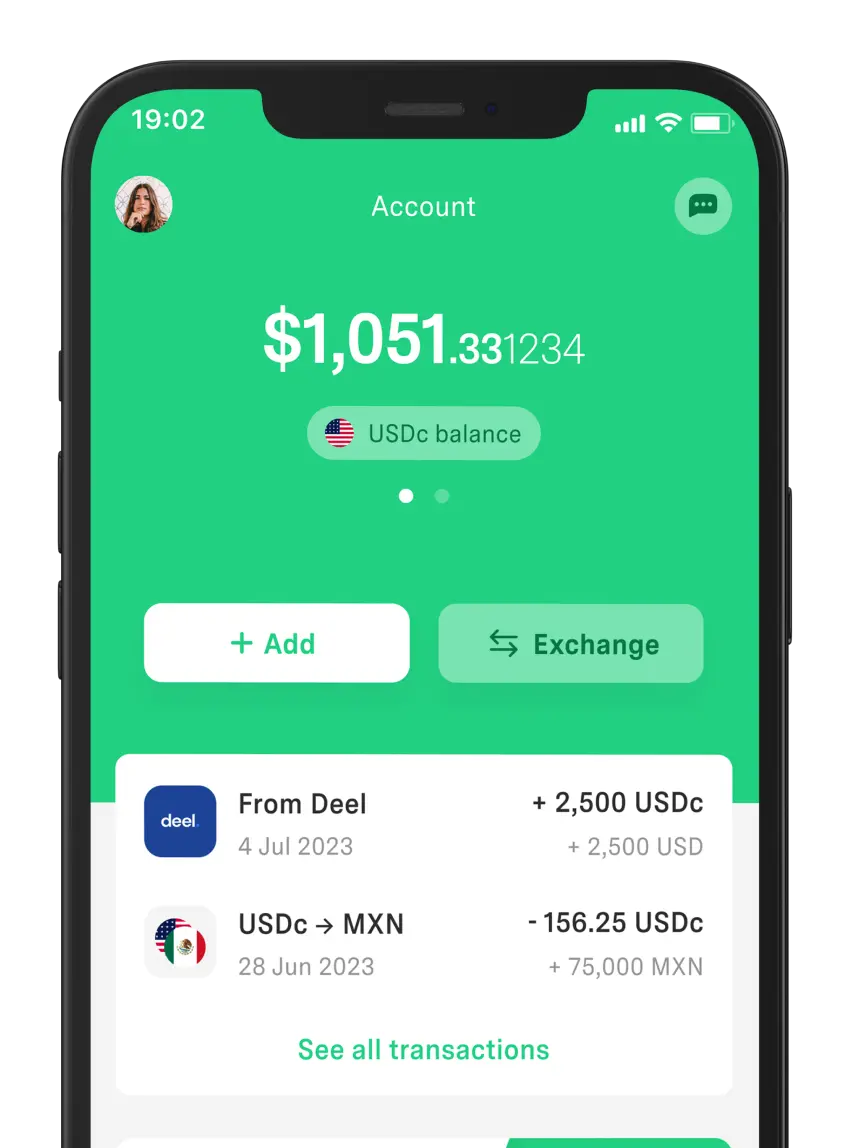
Additionally, tools like DolarApp make receiving international payments seamless, without excessive fees. Just like a great presentation opens doors, smart financial management fuels your growth.
Now that you know how to create creative presentations, make every opportunity count with the right strategies and tools.
Discover a world without borders.
The world has borders. Your finances don’t have to.


 Freelancer tips